Case Study
OphyAI
AI-Powered Toolkit
Designing an end-to-end job seeker platform that grew to 3,900+ users and generated 1.2M Naira in subscription revenue within 4 months.

Role
Product Designer/Co-Founder
Timeline
2023 - 2024 (1 Year)
Platform
Web Application (SaaS)
Team
Small cross-functional team
01 — OVERVIEW
Project Overview
The job market is increasingly competitive, and most candidates lack the tools, feedback, and real-time support needed to navigate the application process effectively. Alongside a team of friends, I designed and built an AI-powered career platform specifically tailored to help job seekers at every stage — from crafting their resume to acing live interviews.
What started as a simple side project quickly evolved into a fully-featured product trusted by thousands of users.
02 — PROBLEM STATEMENT
The Problem
Job seekers — particularly early-career professionals and those transitioning careers — consistently face a fragmented experience:
- Writing an ATS-compliant standout resume requires expertise most people do not have.
- Interview preparation is often generic, not personalised to a specific role or industry.
- During live interviews, candidates have zero support or real-time guidance.
- Tracking multiple job applications manually is disorganised and stressful.
"How might we create an end-to-end AI companion that empowers job seekers at every stage of their journey?"
03 — GOALS & SUCCESS METRICS
Design Goals
- Primary Goal: Build a unified platform with four distinct but connected tools.
- UX Goal: Deliver a clean, intuitive UX that reduces the learning curve for non-technical users.
- Business Goal: Achieve product-market fit through early traction and paid subscriptions.
- Growth Goal: Iterate quickly based on user behaviour and feedback.

We officially launched the initial design of OphyAI to the public on February 24th, 2025. To encourage adoption and gather real user insights, we made the platform completely free at launch. Our goal was to attract early users, observe how they interacted with the product, and collect honest feedback about the solution we had built.
At the same time, I shared the product with friends who were actively job-seeking or transitioning between roles, hoping they would find value in it and provide practical feedback from their experience.
From my perspective as the product designer, the initial design felt solid and well thought out. However, the feedback we received from users told a very different story. Much of the response highlighted areas where the experience didn't meet user expectations, revealing usability gaps and opportunities for improvement that weren't obvious during the design phase.

"The dashboard is too complicated"
"What do I do next?"
"How do I download my Resume?"
These were some of the feedbacks I got from Users that used OphyAI during this initial phase. After getting this feedback I went back to the drawing board.
How can we make this more simple and less cumbersome?
Solution
Progressive disclosure UI — basic actions are always visible; advanced AI features are surfaced contextually without overwhelming users.
How do I design the copilot for live, high stress use?
Solution
Minimal UI with large text, clear hierarchy, and one-action-at-a-time interactions to reduce cognitive load during interviews.
How do we get Users to pay for our features?
Solution
Personalised onboarding flows, feature discovery prompts, and tiered access to premium tools based on subscription level.
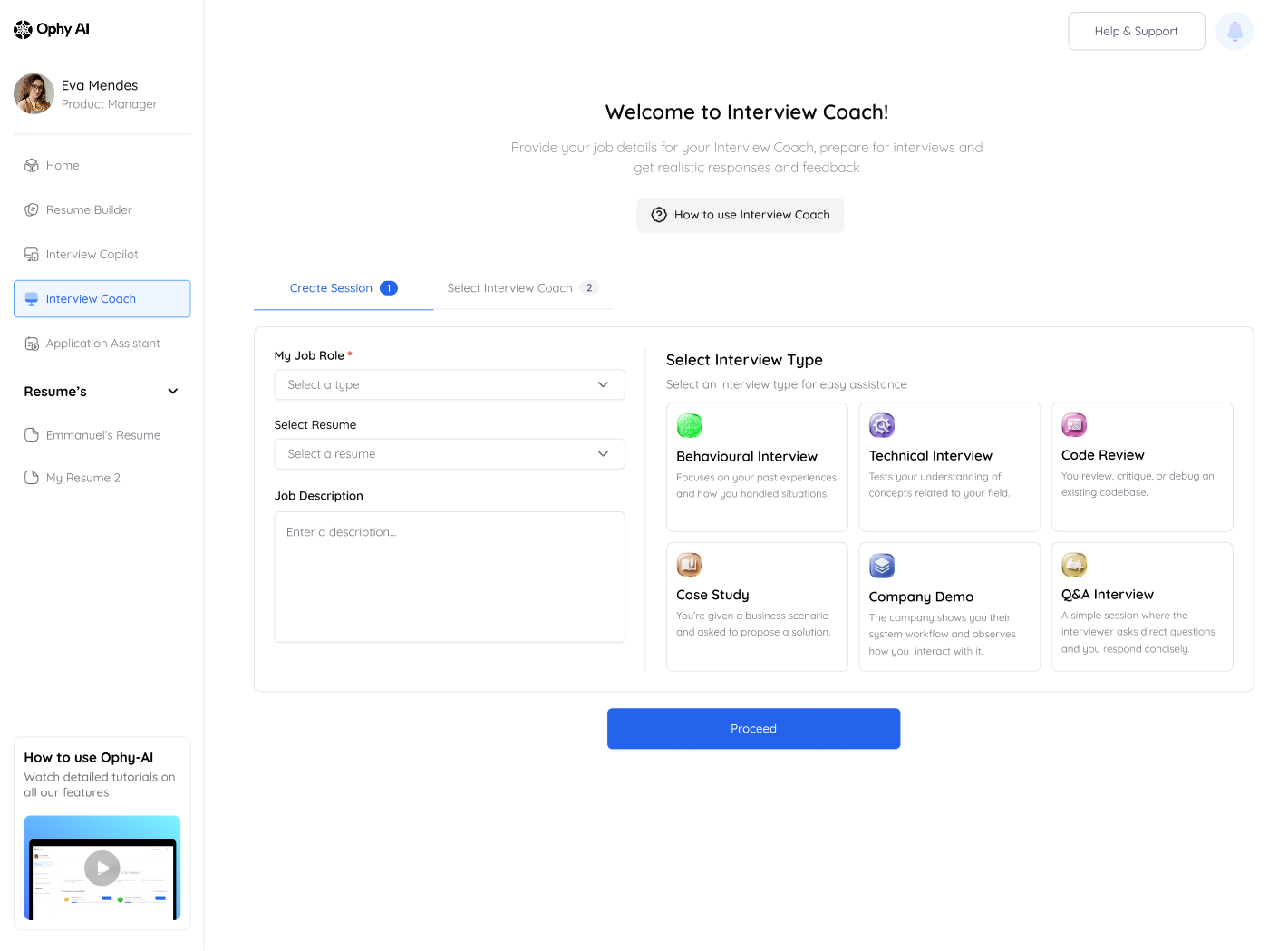
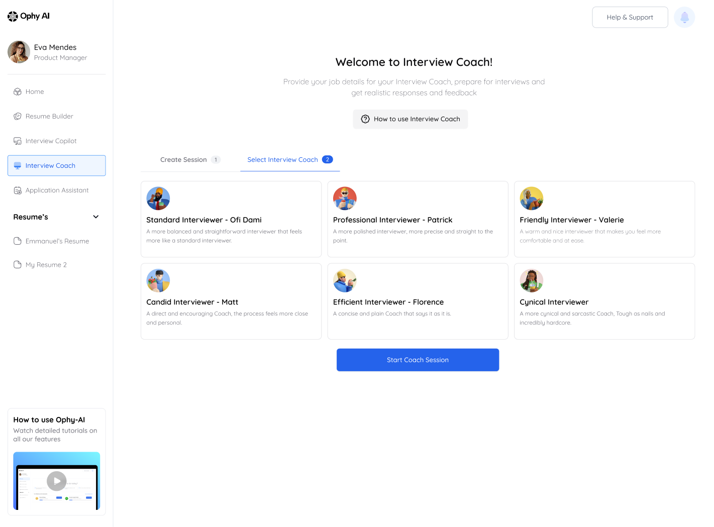
How do we get Users even explore all our features?
Solution
A unified onboarding flow with a personalised checklist guiding each user to the tool most relevant to their immediate need.
The onboarding experience was redesigned to be simpler and more personalized. This update was informed by user feedback and insights from how people interacted with the initial version.
In Version 1, the process lacked clarity and was introduced after onboarding through email. As a result, many users overlooked the call to action and did not engage with it.

To further enhance subscriptions, in the redesigned flow, personalization was integrated directly into the onboarding journey. Users now set up key preferences that shape their account experience from the start. Payment was also intentionally tied to this personalization step through the design. Rather than appearing as a separate action later, funding the account became a natural part of completing the setup, helping users unlock the features tailored to them and making the value of the action clearer within the flow.


This design direction led to a noticeable increase in payment conversions. Within four months of the relaunch, the onboarding flow recorded a significant rise in completed payments, contributing to a measurable increase in revenue generated through the onboarding process.
To further encourage engagement beyond onboarding, we also introduced an Achievements feature on OphyAI. This system rewards users with credits when they complete specific actions or milestones on the platform. By gamifying key activities such as completing profile setup, exploring tools, or interacting with core features, we were able to drive deeper product exploration and sustained engagement.

We also improved the Interview Copilot experience by addressing key UX challenges that previously made the feature harder to discover and understand. The redesign focused on clearer entry points across the product, improved guidance around how the feature works, and a more intuitive interaction flow.

Interview Copilot
The Resume Builder was also refined to improve usability and clarity. In the earlier experience, users often struggled with where to begin, how to structure their information, and how the AI-assisted features supported the resume creation process.
The redesign focused on simplifying the workflow and making the experience more guided. Clearer step-by-step sections were introduced to help users move through the resume creation process with less cognitive load. We also improved the visibility and placement of AI-assisted suggestions, helping users better understand how the tool could enhance their resumes rather than feeling like an additional layer of complexity.
Feature entry points were also refined to make the Resume Builder easier to discover within the platform. These improvements made the tool feel more approachable, structured, and aligned with the broader goal of helping users present themselves more effectively during their job search journey.

04 — DESIGN
Design


05 — KEY ACHIEVEMENTS
Impact at a Glance
6000+
Users in 1 Year
$4k+
In 4 Months
150+
Total Subscribers
06 — OUTCOMES & LEARNINGS
Results
- Grew to 4000+ registered users within the first year of launch through organic word-of-mouth and targeted social media outreach.
- Generated $4k in subscription payments within just 4 months of enabling paid tiers, validating strong product-market fit.
- Consistently high engagement with the Interview Copilot and Resume Builder, which became the two most-used features.
- Positive qualitative feedback highlighted ease of use, AI suggestion quality, and real-time interview support as standout strengths.
Read Next

