Case Study
ARMOne Version 2
Taking ARMOne to the next stage
Giving ARMOne a fresh perspective on version 2, increasing user registration +256.11% and increasing new client funding by +794.36%.

Role
Product Designer
Timeline
2024 – Till Date
Platform
Mobile & Web
Collaborator
Matthew Ulodo, Design Team Lead
My Role
Contract Product Designer
Visual direction, UX strategy, onboarding flows, UI systems, and cross-functional alignment with the internal design team.
Duration
November 2024 – Till Date
Active design engagement across two reporting cycles, spanning product research, ideation, prototyping, and handoff.
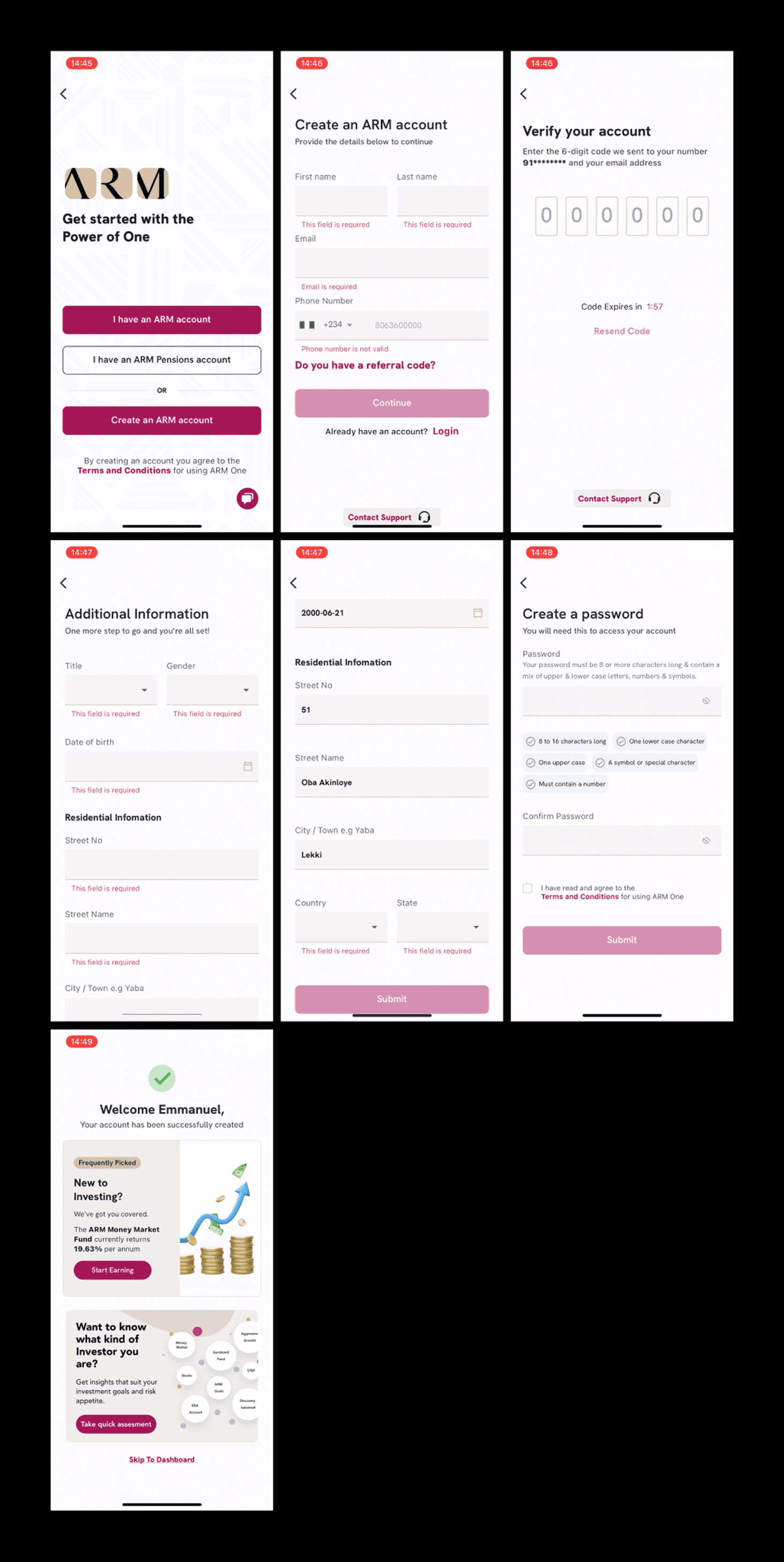
Project Overview
I was contracted by ARM Holdings to bring a fresh design perspective to ARMOne, their flagship investment and wealth management platform. The mandate was clear: the product had strong business fundamentals, but the user experience was creating friction that stalled activation and eroded trust, particularly among first-time investors navigating their financial journey on mobile.
Working alongside Matthew Ulodo, Product Design Team Lead, I joined at a critical inflection point. ARM was simultaneously transitioning from an on-premises V1 infrastructure to a cloud-native V2 architecture. Rather than treating this as purely a backend change, we recognised it as an opportunity to rethink how the product communicated, guided, and built confidence with its growing user base.
My approach was deliberately research-grounded. Before proposing a single solution, I downloaded the ARMOne app, created a real account, completed the full onboarding flow, funded my wallet, and audited every screen personally. I then cross-referenced my firsthand experience with App Store and Play Store user reviews to validate that the problems I identified were not isolated. They were systemic.
What We Were Solving
Through a combination of user interviews, session recordings, and support ticket analysis, we identified three core friction areas that were stalling both acquisition and activation.
Problem 01
Trust deficit at first contact
New users landed on a registration flow that felt transactional. There was no context, no signal of what they were signing up for, and drop-offs were high during email verification.
Problem 02
Onboarding dead-end
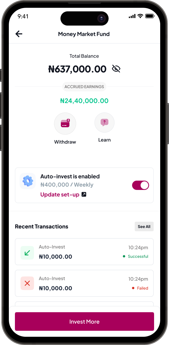
Clients who completed the onboarding process had no clear next step. A funded cash balance sat dormant, with no guidance on how to put money to work.
Problem 03
UI fragmentation
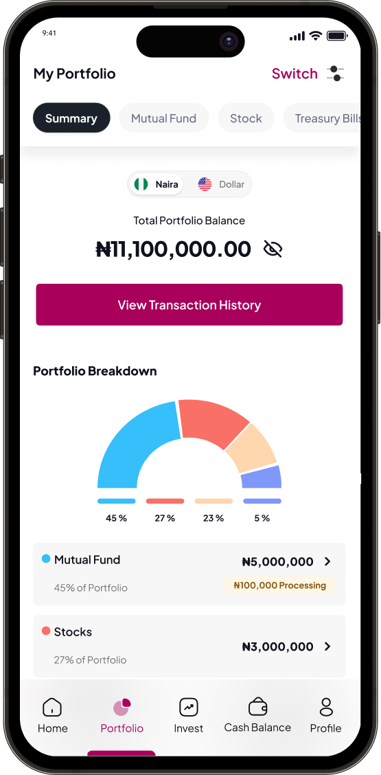
The V1 interface had grown organically. Inconsistent components, competing visual hierarchies, and weak information architecture made the product feel immature relative to its capabilities.
Problem 04
A Journey Defined by Silence
The clearest finding from both my firsthand audit and user review analysis was that the app went silent at every critical moment. After completing KYC, silence. After funding the wallet, silence. Users were left stranded, unsure if their actions worked, and with no indication of what to do next.

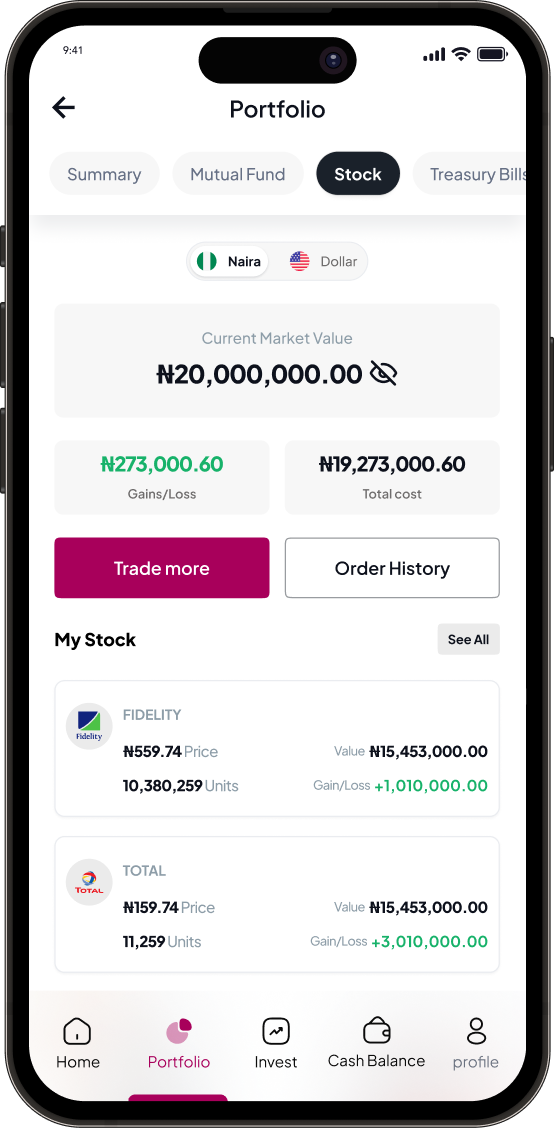
ARMOne V1
Real Users, Real Pain
Before proposing any solution, I grounded the audit in actual user voice. I read through dozens of App Store and Play Store reviews to confirm that the friction I experienced firsthand was consistent across the user base and not edge cases.
App Store · 146 ratings
Play Store · 1,330+ reviews 500K+ downloads
The Play Store rating is particularly significant. More than 1,300 reviews at 2.9 stars represent a broad, consistent signal that the issues were systemic, not isolated. Four recurring themes dominated the feedback.
No Feedback After Funding
Account processing for over a week
Users funded their wallet but were unable to invest or withdraw money after several emails to support.
Onboarding Friction
Profile upload takes way too long
Slow onboarding with no progress feedback. Users questioned reliability before even investing.
No Clarity
Very poor profile setup
The dashboard showed activation in progress and rejected documents for months, but never said which document was rejected.
Trust Broken
The worst investment ever
Users spent over a month trying to upgrade, made payments, and were later told the account was never active. That broke trust completely.
Competitive Analysis
To ensure ARMOne also met users' needs and maintained trust and confidence in a way that aligned with industry standards, we conducted a detailed competitive analysis. We examined existing investment applications closely to identify best practices, gaps, and opportunities we could translate into the experience.


Our evaluation focused on the time required to set up an account and complete key actions, security requirements, how product data was presented, ease of use, accessibility, and the strength of each app's trust signals.
How We Responded
Matthew and I structured the design response around three pillars: build trust early, activate users with clarity, and create a scalable visual foundation for the V2 platform.
Trust & Guidance System
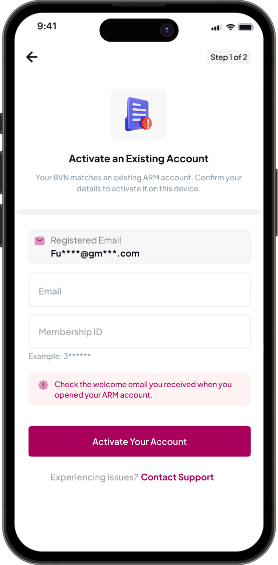
Progressive onboarding with intent
We redesigned the registration and verification experience to surface brand credibility, regulatory anchors, and social proof at each step, converting first impressions into confidence.
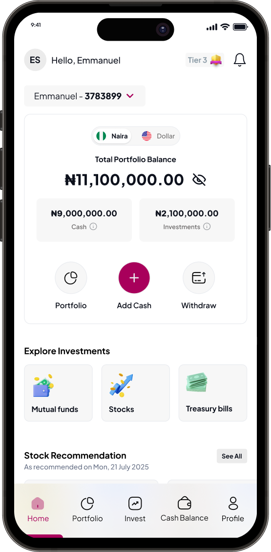
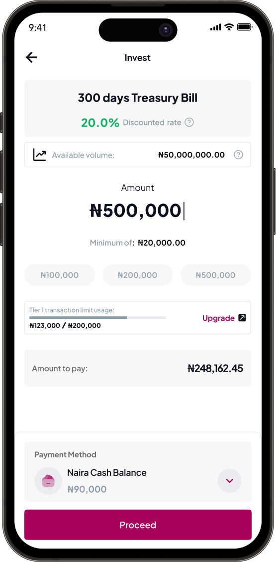
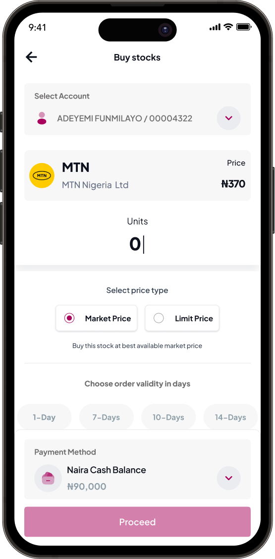
Activation Loop
Fund → Invest → Grow
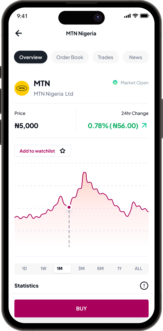
We introduced a three-part post-onboarding flow that held the user's hand from cash balance funding to their first active investment, removing ambiguity around what happens next.
UI System
Component library & design tokens
We built a lean, consistent component library aligned with the cloud-native V2 roadmap, scalable, dark-mode ready, and faster for engineering to implement.
Visual Refresh
Premium but approachable aesthetic
ARM's brand equity is substantial. We brought that gravity into the product UI through refined typography, more purposeful use of the brand palette, and data visualisation patterns that communicated growth, not just numbers.
Transforming Silence Into Guidance
The design response was structured around one principle: every completed action must receive immediate feedback, and every confirmed state must prompt the next step. No more dead ends. No more silence. The user is guided through the entire journey from verification to their first investment.
The Improved User Flow: KYC to First Investment
KYC Complete
"You're verified!" modal + Fund Cash Balance Modal immediately shown
Funding Confirmed
"₦50,000 received!" + "Start Investing" prominent CTA
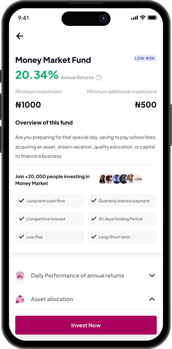
Select Product
Recommendations labelled "Popular with beginners" with risk labels shown
Risk Education
Plain language risk explanation with return expectations — no jargon
First Investment
"You're invested!" celebration modal with clear next steps shown
Design
Onboarding Flow Improvement
Three Solution Pillars
Pillar 1
Instant Feedback
KYC success modals, funding confirmation, push notifications, and progress indicators were introduced to remove ambiguity at every critical moment.
Pillar 2
Clear Path Forward
Prominent invest-now prompts, surfaced beginner recommendations, and stronger homepage hierarchy made the next action obvious.
Pillar 3
Build Trust
Protected-funds messaging, progressive risk disclosure, and social proof were used to reduce anxiety for new investors.
Design
From wallet funding to confident investing


Addressing Financial Anxiety With Plain Language
Before (V1)
Confusing jargon
"Market volatility exposure" — Investment products labelled CONSERVATIVE, LIBERAL, BALANCED with no explanation. New investors had no mental model for these terms.
After (Proposed V2)
Plain language + visual risk indicators
Value may change daily" — Color-coded risk levels (Low · Medium · High). Easy escape routes: "Start with ₦5,000" · "Withdraw anytime" · "No lock-in." Handles hesitation proactively.
Designs
The Numbers — YoY Comparison
Measured across the identical Jul 10 – Oct 15 window in both 2024 and 2025, ARMOne posted extraordinary year-over-year growth — a direct reflection of the combined design, engineering, and infrastructure improvements delivered during the engagement.
Registered Users
+256%Completed email verification. Improved conversion noticed at the top of the registration funnel.
New Clients Onboarded
+745%Fully onboarded ARMOne clients. The clearest signal of onboarding UX improvement delivering results.
New Client Funded Inflows
+794%Inflows from newly onboarded clients during the reporting period. Wallet adoption gaining strong traction.
Total Inflows (All Users)
+281%All customers regardless of onboarding period. Platform trust and wallet reliability driving retention.
Business Insights from the Data
- Growth is largely volume-driven — the UX work unlocked more users completing the funnel, not just higher ticket sizes per client.
- Wallet adoption gained strong traction since V2 launch, validating the Fund → Invest flow as a strategic retention lever.
- The gap between registered users (16,317) and fully onboarded clients (5,992) confirms that activation — not acquisition — remains the single biggest opportunity.
- Despite strong growth, onboarding journey quality and wallet reliability remain priorities — feedback continues to surface both areas.
Read Next

